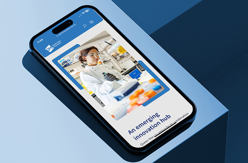
Make sure your website looks great and works perfectly on every device, from mobiles to widescreens.
What Is Responsive Website Design and Why Does It Matter?
Have you ever visited a website on your phone and had to pinch, zoom or scroll sideways just to read the content? That kind of frustration usually means the site is not responsive.
In 2025, people are browsing on all sorts of screens. Phones, tablets, laptops, desktops and even foldable devices are now the norm. If your website does not adjust to different screen sizes, you risk losing visitors, hurting your search rankings and damaging your brand.
That is where responsive website design comes in. At Identity Creative, it is something we consider right from the beginning of every web project.

A responsive website is designed to automatically adapt its layout and functionality to suit the screen it is being viewed on. Whether someone is on a mobile, tablet or desktop computer, the site still looks great and is easy to use.
Rather than building different versions of the same site, responsive design means having one website that works well everywhere.
Why Responsive Design Still Matters
Why Tablet Optimisation Matters Too
While many businesses test for mobile and desktop, tablet users are often overlooked. Tablets sit somewhere in between, and they need layouts that are tailored for that experience.
At Identity Creative, we always include tablets in our testing. We make sure that your website is functional and visually consistent on screens of every size.
How Responsive Design Supports SEO
Responsive design is not just good for users. It also plays a big role in your website’s visibility in search engines.
Here is how it helps:
A better user experience usually leads to better rankings, and responsive design is at the heart of that.
Our Approach at Identity Creative
We do not just add responsiveness at the end of a project. We design and build every site with responsiveness in mind from the very beginning.
Whether you are using WordPress, a custom CMS or starting from scratch, we:
Start with mobile-first layouts
Test across mobiles, tablets and desktops
Use flexible design systems that scale well
Optimise for performance and speed
Make sure the user journey feels intuitive across all devices
We build websites that are designed to grow with you, and perform at their best on every screen.
Get in touch for a free responsive website review
Or explore our Web Design Services to learn more about how we work
Whether you’re just starting out or ready to grow further, Identity Creative is here to support you with all your creative and technical needs.