Fonts are one of the most powerful and often overlooked parts of branding and design. The right font can make your business look professional, trustworthy, and easy to understand. The wrong one? It can make your logo unreadable or your website look unpolished.
Choosing the right font isn’t just about style, it’s about communicating your brand’s personality clearly and effectively. Let’s look at the differences between font types, common mistakes, and how to choose the right typography for your business.
1. Serif vs sans serif: what’s the difference
Understanding the two main font categories is the first step to picking the right one.
Serif Fonts
Serif fonts have small decorative strokes or “tails” at the ends of their letters, think of classics like Times New Roman or Georgia. They’re often seen as traditional, professional, and trustworthy, making them great for industries like law, finance, and publishing.
Best for:
Sans Serif Fonts
Sans serif fonts are clean, modern, and easy to read on screens. Examples include Helvetica, Arial, and Open Sans. They feel fresh, approachable, and minimal, which makes them ideal for digital-first brands and tech companies.
Best for:
A good rule of thumb: use serif fonts for formality, and sans serif fonts for clarity.
2. Why readability comes first
No matter how stylish a font looks, if people can’t read it easily — it’s not doing its job. This is especially true for logos.
Many small businesses fall into the trap of choosing a heavily scripted or overly decorative font because it looks “unique.” The problem is, once it’s scaled down on social media or printed small, it becomes almost impossible to read.
How to avoid this:
Clarity is confidence. If your audience can read your name instantly, they’re more likely to remember it.
3. Pairing fonts that work together
Using more than one font can add visual interest — but it needs balance. Too many font styles can make your materials look messy or unprofessional.
Tips for pairing fonts:
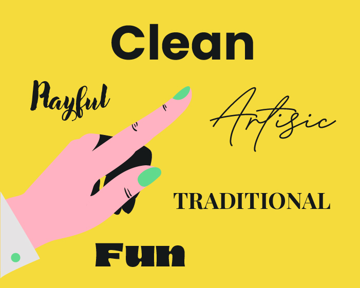
4. Matching your font to your brand personality
Your typography should reflect who you are as a brand. A playful, rounded font might suit a children’s company, but not a legal firm. Likewise, a sleek, minimal sans serif might work for a modern agency, but not a vintage boutique.
Ask yourself:
Typography has just as much personality as colour or imagery — so make sure it fits your brand story.
5. Keep it consistent across all platforms
Once you’ve chosen your brand fonts, stick to them. Using different fonts across your website, social media, and print materials can make your brand feel inconsistent.
How to stay consistent:
Your choice of font says more about your business than you might think. Whether you go for the elegance of a serif or the simplicity of a sans serif, make sure your typography is clear, consistent, and true to your brand.
At Identity Creative, we help businesses develop branding and typography that work beautifully across every medium from your logo to your website.
Whether you’re just starting out or ready to grow further, Identity Creative is here to support you with all your creative and technical needs.